The Battle Continues

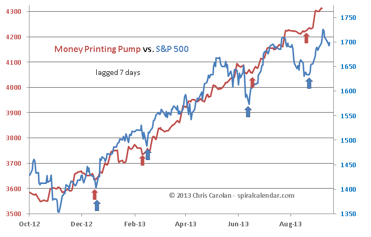
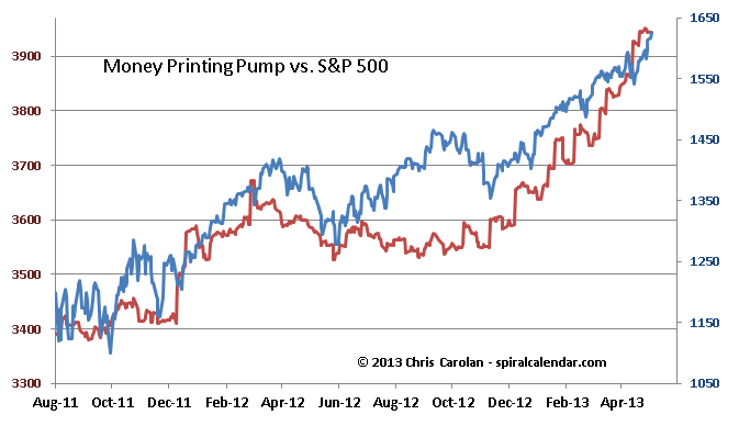
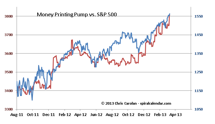
The battle between the Autumn seasonal down cycles and the FED's money pump continues. The coming week is the most dangerous period for stocks, but the FED seems to have everything well-stabilized thanks to is money printing efforts.

092613pump

click chart to enlarge

092613analog

click chart to enlarge 

Subscribe to see the rest of this post.

Charts-A-Plenty

Solunar Model Charts - Money Printing Pump Charts - Central Bank Ratio charts all included today. Here's two for the pubic section of the post - the rest are inside for subscribers.  

050713pumpshort

click chart to enlarge

The Money Printing Pump chart shows the FED's balance sheet plus 20% of the ECB's balance sheet converted to dollars. Simply put, stocks will continue higher so long as the powers that be are printing money.

050713fedecb

click chart to enlarge

The ratio of FED to ECB assets correlates well with FX rates over time, much better than the Solunar Model for those markets.  The ratio of FED to Japanese central banks assets is included in the subscriber content below.

Subscribe to see the rest of this post.

More Thoughts on Gold – Physical vs. Paper.

There's been plenty of talk about physical gold versus paper gold. I thought it might be of interest to look at the price  differential - specifically - the difference between the spot price of gold in Shanghai and the paper gold price (GLD x 10) in NYC.  The results are interesting.

Subscribe to see the rest of this post.