A large body of my work can be classified as “calendar research” – investigations into the various calendar phenomenon present in the markets. There are four distinct accomplishments of this research, and in each case, we can point to dramatic and extraordinary real-time forecasts that lie far outside the realm of ‘lucky’ market calls.
The timing of maximum panic
The original observation on the lunar calendar link to market panics. The best place to read this research is “Autumn Panics, a Calendar Phenomenon” a 1998 Charles Dow Award winning paper. That research was used to pinpoint the time of maximum panic in October 2008 when the VIX index, measuring fear in the markets, reached its collapse extreme. Those blog posts are here. and here.
The Spiral Calendar
Tthe original research detailing the logarithmic and lunar based cycles that link extreme emotional events. The book of the same name, used copies are available from Amazon is the best place to learn this technique. The Spiral Calendar’s extraordinary effectiveness was demonstrated in the June 2008 report that detailed the precise timing of the important crude oil top that occurred one month later. The details of that forecast are here.
Eclipse cycles as drivers of the Long-Wave
This work evolved in the early 2000s and was presented in pieces within Special Report issues of Calendar Research Reports, my former publication. I may make them available at some point in the future, or compile the work in another form (book?). This example from the 2004 Special Report detailed the timing of the double-top that was still years away from forming. Many analysts correctly foresaw the inevitable collapse that was built into the debt bubble as the 2000s unfolded. But their methodologies gave them no clue as to when the criticial turn would occur.
The Solunar Model
A seasonal model averaged from past similar solar-lunar alignments as a predictor of market direction. For the second half of 2008 and early 2009 this model has tracked the Dow Jones Industrial Average with remarkable accuracy.
Taken together, to have so many different and original observations of market phenomenon verified in the real world of market experience, is an accomplishment that I believe, no other technical market analyst living or dead, has achieved.
Technical indicators
Separate from the calendar research area of my investigations, are a set of technical indicators useful for identifying trends, support and resistance and imminent changes in trend.
Range Bust Bars

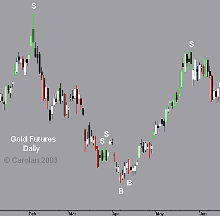
Range-Bust bars are colored bars applied to a black & white candlestick chart. The bars are colored when their range exceeds their ‘projected range’ by a set percentage. Projected range is a concept from Tom DeMark. Projected range assumes that the next bar will be most like the current bar. When those expectations are not met, a colored bar ensues, red for down and green for up. Most green bars are also white, as they closed above the open price. Most red bars are black, as they closed below the opening price.
Occasionally, we have red and white or green and black bars. These are Range-Bust Reversal bars. They are particularly valuable when they come at the end of a prolonged trend. They work best on daily and weekly charts. The gold chart below shows the outstanding forecasting ability of Range-Bust Reversal Bars.
Cycle Traps

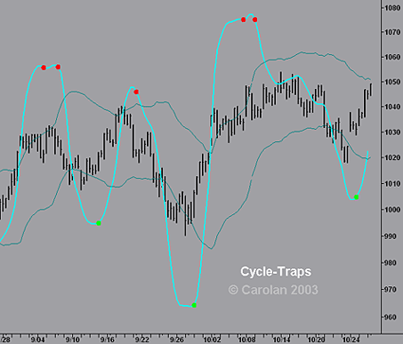
Moving Averages, in their quest to find the trend and suppress noise, invariably suppress the existing cycles. Detrending indicators are better at cycle detection but have more noise than moving averages. My Cycle-Trap lines are an attempt to find a happy medium. I combine them with Keltner Channels and mark those reversals in the Cycle-Trap that occur outside the channels. Cycle-Trap reversals within the channel that are in the same direction of the channel are strong signals as well.
The Cycle-Trap originated as an attempt to clone ATHBO’s “ii-prop” indicator.
RSI Divergence
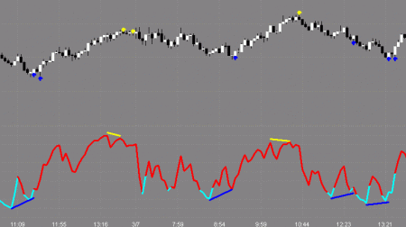
The graphic at the top of every blog page shows the RSI Divergence indicator. This concept is not original, but the coding to locate them is done somewhat differently here than standard TA packages. The chart below shows the RSI itself on the bottom clip, but on the blog charts, only the signals marked with blue (buy) and yellow (sell) crosses are shown.

Net-Lines

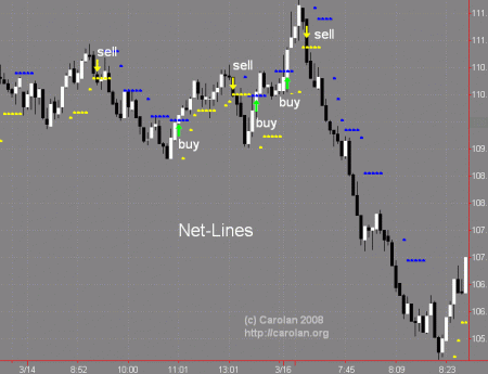
Net-Lines are a reversal pattern. The line is set up when there are three consecutive bars either up or down. Three up bars would set the line at the low of the first bar, which if penetrated on the close results in a sell. Three consecutive down bars puts the line at the high of the first bar, which if penetrated to the upside is a buy.
I’ve modified the idea a couple of ways. One, I define the bars with a ‘weighted close’ – (H+L+C+C)/4 and I expire the net line after 5 bars, as I’m interested in the speed of the reversal signal. The buy Net-Lines are blue dots on the charts, the sell Net-Lines are yellow dots.