Solunar Model Charts - Money Printing Pump Charts - Central Bank Ratio charts all included today.
Here's two for the pubic section of the post - the rest are inside for subscribers.
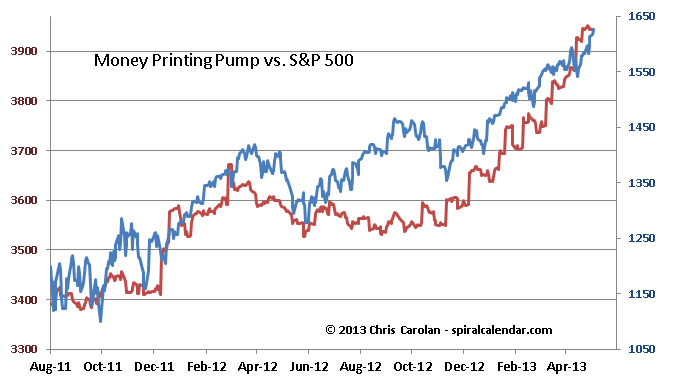
click chart to enlarge
The Money Printing Pump chart shows the FED's balance sheet plus 20% of the ECB's balance sheet converted to dollars. Simply put, stocks will continue higher so long as the powers that be are printing money.

click chart to enlarge
The ratio of FED to ECB assets correlates well with FX rates over time, much better than the Solunar Model for those markets. The ratio of FED to Japanese central banks assets is included in the subscriber content below.