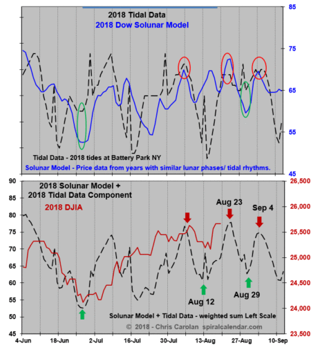
The chart below shows the tight recent correlation between three different series, the 2018 tidal data, the 2018 Solunar Model, a seasonal model of Dow prices from years with similar lunar phases, and finally the 2018 Dow itself.
This chart is updated in the subscriber area through October.
click chart to enlarge
click chart to enlarge
Subscribe to see the rest of this post.

