The street seems convinced that the metals will get crushed as interest rates rise. My position for months (before Covid) was that a transition to Long Wave summer (i.e. the 1970s) will see metals hold their own in the face of rising rates. Today, metals up, bonds down. We seem to be having more days like that lately.
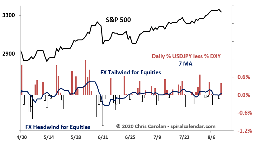
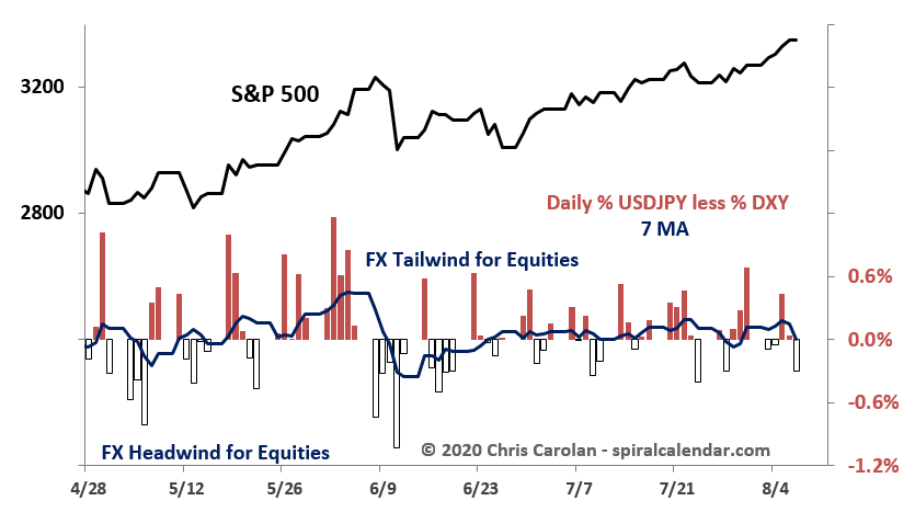
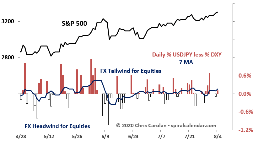
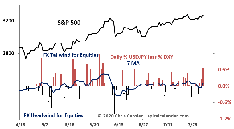
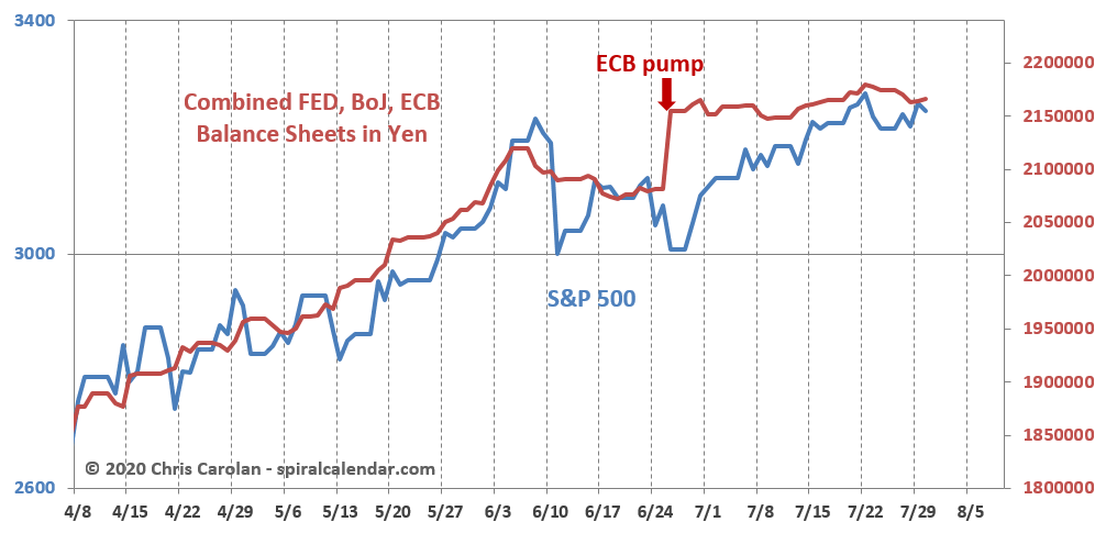
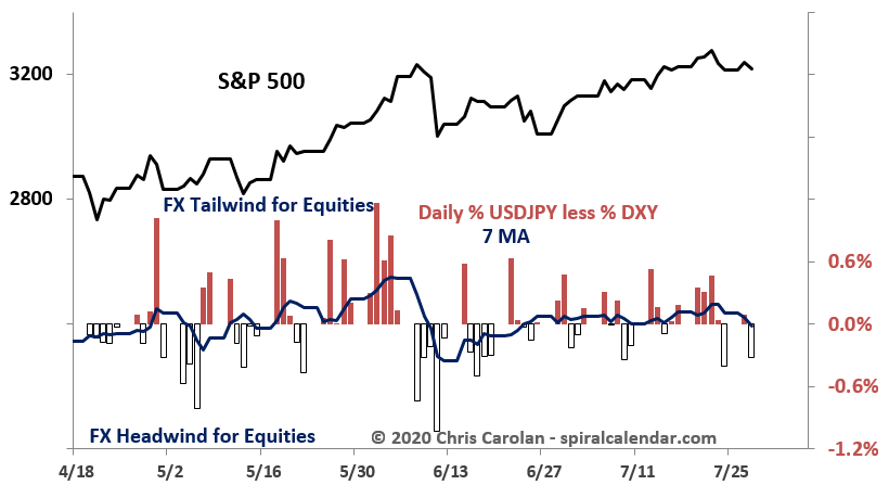
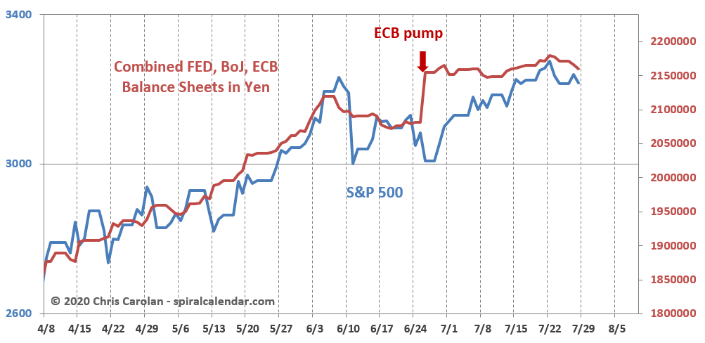
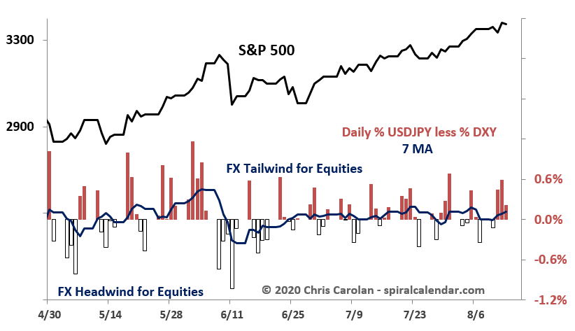
Meanwhile, the lid on the DXY remains stocks best friend. (for now.)
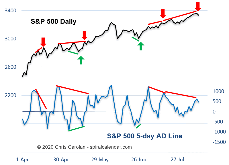
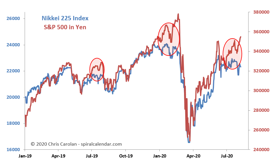
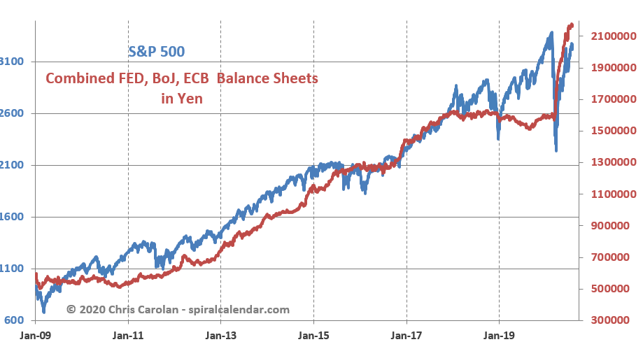
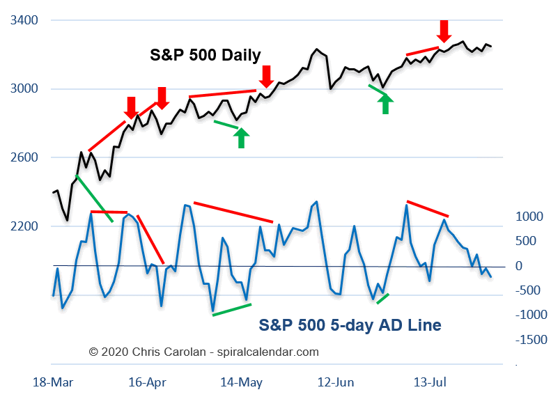
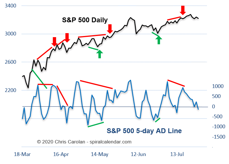
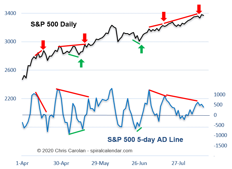
click chart to enlarge
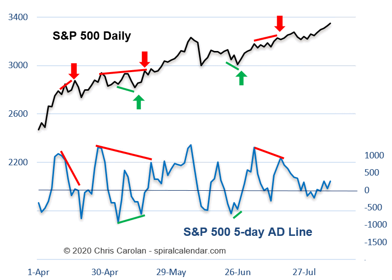
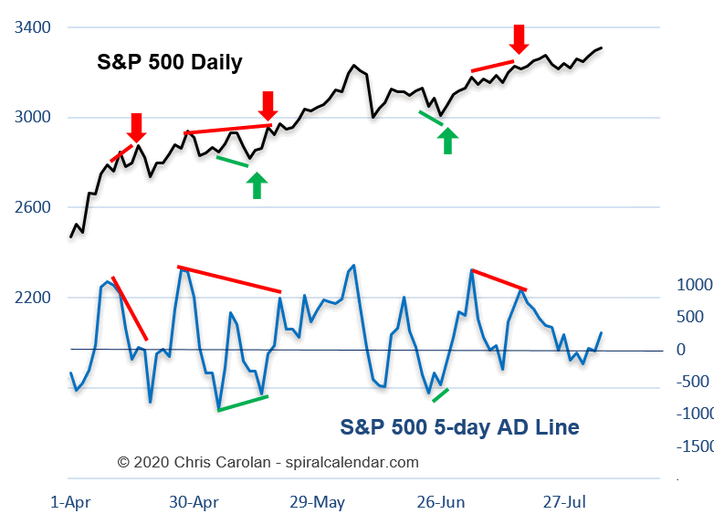
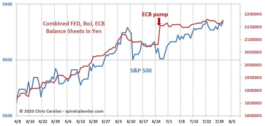
click chart to enlarge