Fed defeats Cycles
click chart to enlarge
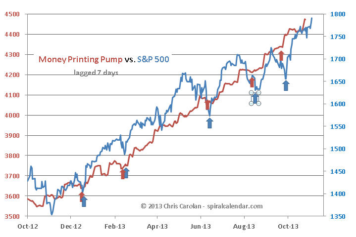
The latest release of Fed balance sheet data this evening shows a strong pop in the 7-day lagged MoneyPump figures derived from the balance sheet plus a fraction of the ECB's balance sheet. Once again, MoneyPump expansions are lining up with fresh rallies in equity prices.
Subscribe to see the rest of this post.
Signals
Subscribe to see the rest of this post.
Cycles vs. The FED
click chart to enlarge
Stock prices have closed the gap with the MoneyPump in the past few weeks. We can see how the pump has gone relatively quiet in recent weeks. I'm now lagging the pump by seven days on the chart, as that seems the best fit between renewed S&P rallies and pump surges as shown with the arrows.
click chart to enlarge
I've added the 1929 comparison chart to this analog set. It's just amazing how similar the patterns are in years where prices topped on or near a late summer new moon. We are now at the equivalent point to the Yom Kippur highs of both 1987 and 1929 (green arrows). Do we crash now?
Subscribe to see the rest of this post.
More Analog Stuff
But It’s Still Autumn
September comes with implications, no matter how strong the market was today.
Subscribe to see the rest of this post.
Weekly Update
Subscribe to see the rest of this post.
That Summer Analog
click chart to enlarge
Discussion continued within for subscribers...
Subscribe to see the rest of this post.