Fed defeats Cycles

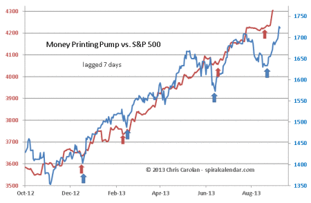
Last week I described the market as the Fed with it's MoneyPump weapon of choice versus the Cycles, and their tendency to wreck havoc on markets in autumn. Well, the match has been decided, and the MoneyPump continues to reign supreme as the primary driver of U.S. equity prices now.   091913pump
click chart to enlarge

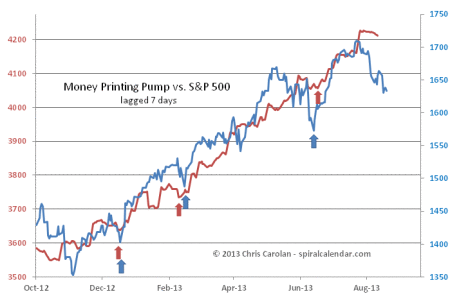
The latest release of Fed balance sheet data this evening shows a strong pop in the 7-day lagged MoneyPump figures derived from the balance sheet plus a fraction of the ECB's balance sheet. Once again, MoneyPump expansions are lining up with fresh rallies in equity prices.

Subscribe to see the rest of this post.
Cycles vs. The FED

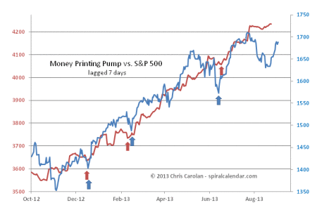
and the war continues. Cycles push the market one way, via seasonal downward pressures, and the FED pushes markets the other, via the MoneyPump. Who wins? Not traders it seems.

091513pump

click chart to enlarge

Stock prices have closed the gap with the MoneyPump in the past few weeks. We can see how the pump has gone relatively quiet in recent weeks. I'm now lagging the pump by seven days on the chart, as that seems the best fit between renewed S&P rallies and pump surges as shown with the arrows.

091513anal2

click chart to enlarge

091513anal1

click chart to enlarge

091513anal3

click chart to enlarge

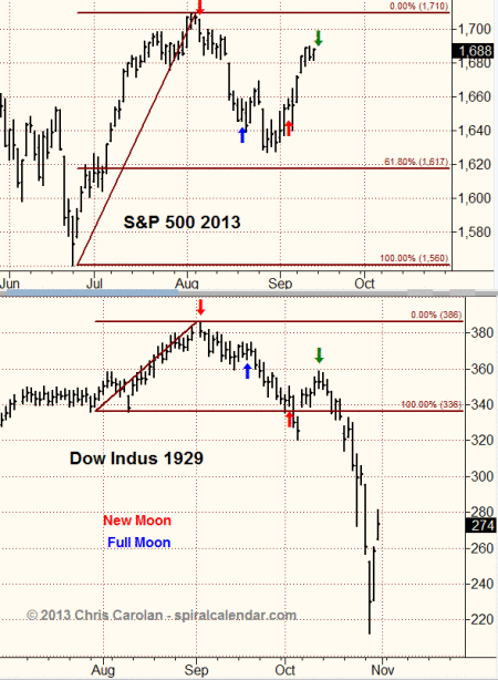
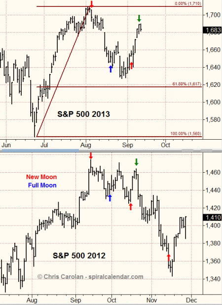
I've added the 1929 comparison chart to this analog set. It's just amazing how similar the patterns are in years where prices topped on or near a late summer new moon. We are now at the equivalent point to the Yom Kippur highs of both 1987 and 1929 (green arrows).  Do we crash now?

Subscribe to see the rest of this post.